Section Topics
Navigating the InterAction Report Designer
The report designer is accessed by choosing the Design Report button from the Report Output tab when editing a report. When creating a new report, choose Design Report when you are prompted for report design/output information in the New Report Wizard.
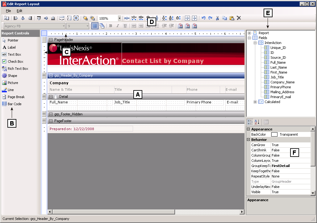
InterAction Report Designer
[A] Report Detail Area
[B] Toolbox
[C] Horizontal and Vertical Rulers
[D] Format & Alignment Toolbar
[E] Fields List (InterAction and calculated fields)
[F] Properties Area
Report Detail Area
The report detail area includes both sections and section headers. The following sections are available on or can be added to a report layout. Each section is identified by a section divider. The section divider shows the name of the section. When working on a report layout, you can show and hide sections by choosing the collapse  or expand
  button next to the name of the section.
NOTE When designing Overview report sections, the ReportHeader/Footer and PageHeader/Footer are not shown because these are not designed on a section level (only on the report level).
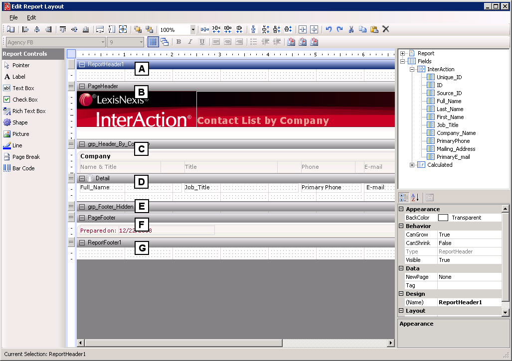
Sections of the InterAction Report Designer Report Detail Area
[A] ReportHeader
[B] PageHeader
[C] GroupHeader
[D] Detail
[E] GroupFooter
[F] PageFooter
[G] ReportFooter
ReportHeader
A report can have one report header section that prints at the beginning of the report. It is generally used to print a report title, a summary table, or any information that needs to appear only once at the top of the report.
ReportFooter
A report can have one report footer section that prints at the end of the report. It is used to print a summary of the report, grand totals, or any information that needs to print once at the report's end.
PageHeader
A report can have one page header section that prints at the top of each page. It is the first section that prints on the page except when the page contains a report header section. The page header section is used to print column headers, page numbers, a page title or any information that needs to appear at the top of each page.
PageFooter
A report can have one page footer section that prints at the bottom of each page. It is used to print page totals, page numbers or any other information that needs to appear at the bottom of each page.
GroupHeader, GroupFooter
A report can consist of a single or multiple (nested) groups, with each group having its own header and footer sections. The header section(s) are inserted and printed immediately before the detail section. The footer section(s) are inserted and printed immediately after the detail section.
Detail
A report has one detail section. The detail section is the body of the report and one instance is created for each record in the report.
Horizontal and Vertical Rulers
The horizontal and vertical rulers can assist in lining up controls. Unlike other applications, changing the size of the page on the ruler does not modify the size of the margins defined for the report. For details on modifying page sizes and margins, see Setting the Page Size and Layout.
After you have set the page size and margins, you can modify your report layout's width to match the size you have defined.
The rulers can be shown in inches or centimeters. To change the display:
-
Choose File > Page Setup.
-
On the Report Settings dialog box, choose Global Settings.
-
In Ruler Units, choose Inches or Centimeters.
-
Choose OK to return to the Edit Report Layout dialog box.
Fields List
The Fields pane displays a list of data source fields. The fields list is populated with the InterAction fields you selected to include in your report and also calculated fields.
NOTE For more information on calculated fields, see Calculated Fields.
You can drag and drop fields from the fields list to any section on your report. The InterAction Report Designer automatically creates a TextBox control for the field you placed on your report.
Properties Area
Properties control the look and behavior of each section or control on a report. For example, properties can specify all of the following:
- The background color for the page header is dark gray
- Information on the report is grouped by contact type
- A textbox on the report displays the current date and time
The options available in the Properties list vary depending on which item is selected in the report detail area.
Toolbox
The toolbox allows you to select controls to add to the report. The following table identifies all of the controls available in the toolbox.
| Button | Description |
|---|---|

|
Allows you select controls on the report. |

|
Inserts a new static Label control. Labels are used for labeling information only; you cannot manage the output format. See Adding Labels to a Report. |

|
Inserts a field TextBox control, bound to a database field or unbound. The TextBox control allows you to manage the output format, for example you can grow, shrink, sum, and count fields. For more information, see Adding a Field by Drawing a TextBox. |

|
Inserts a field check box. |

|
Inserts a RichTextBox control. RichTextBox controls are used to add long text fields to your report (fields that contain a large number of characters). See Adding Long Text Fields to a Report for more information. |

|
Inserts a rectangle, circle, or square shape. |

|
Inserts a picture, loaded from a file. See “Adding a Logo or Picture for more information. |

|
Inserts a line. |

|
Inserts a manual page break within a section. See Set a Page Break Before or After a Group for more information. |

|
Inserts a Bar code control. |
Toolbars
Buttons on the format toolbar are only available if you have one or more controls selected on the report layout. Using the options on this toolbar, you can specify items such as the font size and style used for a control. For details on the options, see the following table.
Note that RichTextBox controls use the Normal font style. You cannot change the font for these controls by using the buttons in the format toolbar. To change the font used for RichTextBox controls, you must change the Normal font style. For more information, see Changing the Normal Style (Default Font).


Buttons on the alignment toolbar are available when you have one or more controls selected on the report layout. Using the options on this toolbar, you can more precisely align controls on the report. For details on the options, see the following table.


Buttons on the standard toolbar are available when you have one or more controls selected on the report layout. Using the options on this toolbar, you can perform basic functions like copy and paste. For details on the options, see the following table.
| Button | Description |
|---|---|

|
Undo - Reverses the last action you took. |

|
Redo - Repeats the last action you took. |

|
Cut - Cuts the selected control to the clipboard. |

|
Copy - Copies the selected control to the clipboard. |

|
Paste - Pastes the contents of the clipboard into the current section. |

|
Delete - Removes the selected control(s). |
Buttons on the Report Designer toolbar let you insert a ReportHeader, PageHeader, or GroupHeader onto your report. For details on the options, see the following table.
| Button | Description |
|---|---|

|
Insert Report Header - Inserts a ReportHeader and ReportFooter. |
|
|
Insert Page Header - Inserts a PageHeader and PageFooter. |
|
|
Insert Group Header - Inserts a GroupHeader and GroupFooter. |
Context Menus
Context Menus can be accessed by right-clicking a control or section of the report. Menu options vary depending on what option is currently selected, however the following options are available for all controls.
| Menu Option | Description |
|---|---|
| Insert > Group Header/Footer | Adds a new group header/footer pair to the report. |
| Insert > Page Header/Footer | Adds a new page header/footer pair to the report. A single pair is allowed per report. This option is disabled after the first pair is added. |
| Insert > Report Header/Footer | Adds a new report header/footer pair to the report. A single pair is allowed per report. This option is disabled after the first pair is added. |
| Delete | Deletes the current selected section from the report. This option does not apply to the detail section in the report. |
| Reorder Groups | This option is available when more than one group section is added to the report. It displays a dialog box to allow changes to the nesting order of the group sections in the report. |
| Cut | Cuts the selected control to the clipboard. |
| Copy | Copies the selected control to the clipboard. |
| Paste | Pastes the contents of the clipboard into the current section. |
| Bring to Front | Brings the selected control to the front (in front of other controls). |
| Send to Back | Sends the selected control to the back (behind other controls). |
| Format Border | Displays the border dialog box so that you can select a border. |